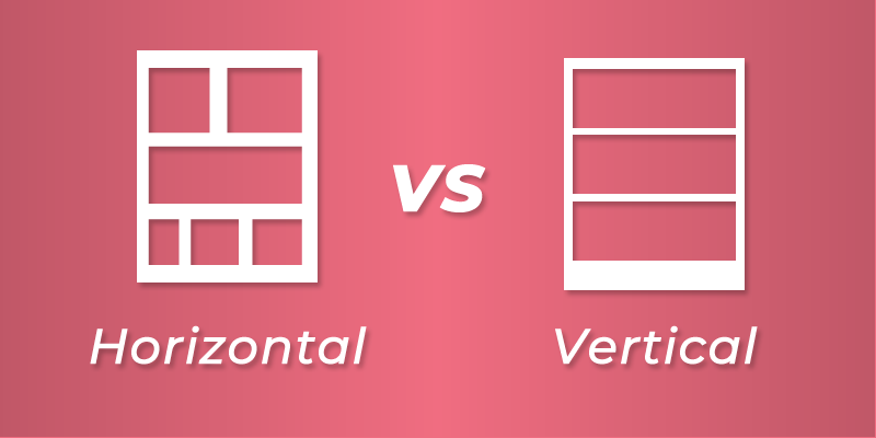
When figuring out the layout for a webcomic, creators are often faced with the question: ‘Should I design it with the old school horizontal layout or the modern vertical(webtoon) layout?’ Short answer is both. Both layouts have their pros and cons depending on which devices the comic is being viewed from. If you want to reach the widest possible audience possible, it’s paramount that you make the right decision for your format. Let’s take a look at the pros and cons of each.
Traditional/Horizontal Format
PROS
- Ideal for large screens like on desktops and laptops.
- Takes less time prepping the comic images for your website.
- If you are planning on printing your comic at some point, this is the format to use.
- Allows for a variety of panel layouts.
- Perfectly suited for action/superhero comics with dynamic panels.
- Ability to lead the readers eye in any direction.
CONS
- Makes for a poor reading experience on mobile devices.
- Restrictions on the detail you can put into each panel of the comic.
- Reader can glance ahead at a panel with a punchline or story twist, lessening the surprise factor.
- Not a good format for webcomic aggregators like LINE Webtoon and Tapas and social media platforms like Instagram.
Webtoon/Vertical Format
PROS
- Provides a great reading experience on mobile devices (smartphones and tablets).
- A wider audience reach. Statistics show that online comics are read more on mobile devices as opposed to desktop devices.
- Used by leading webcomic portals like LINE Webtoon and Tapas.
- With proper slicing of the panels, can be posted on Instagram.
- Greater ability to surprise since you can only view one panel at a time.
- Creator can pack in a lot more detail into each panel (including lettering) making for a more immersive reading experience.
- Works best for short form comics like gag-a-day comics or the daily comic strip format.
CONS
- More work is required to slice comic into images for each panel.
- The format does not work for a print layout as you can pack fewer panels into a page compared to the traditional layout.
- Panels are too large for large screens.
- Requires a lot of scrolling
- Slows down the pace of reading which makes it ill suited for action comics or short form comics.
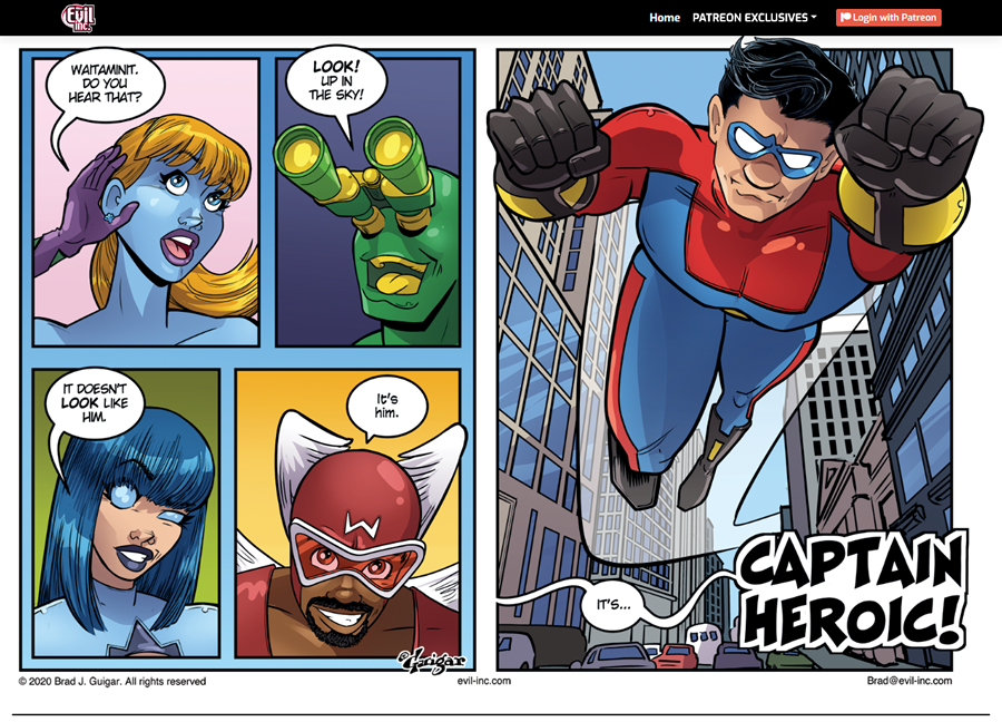
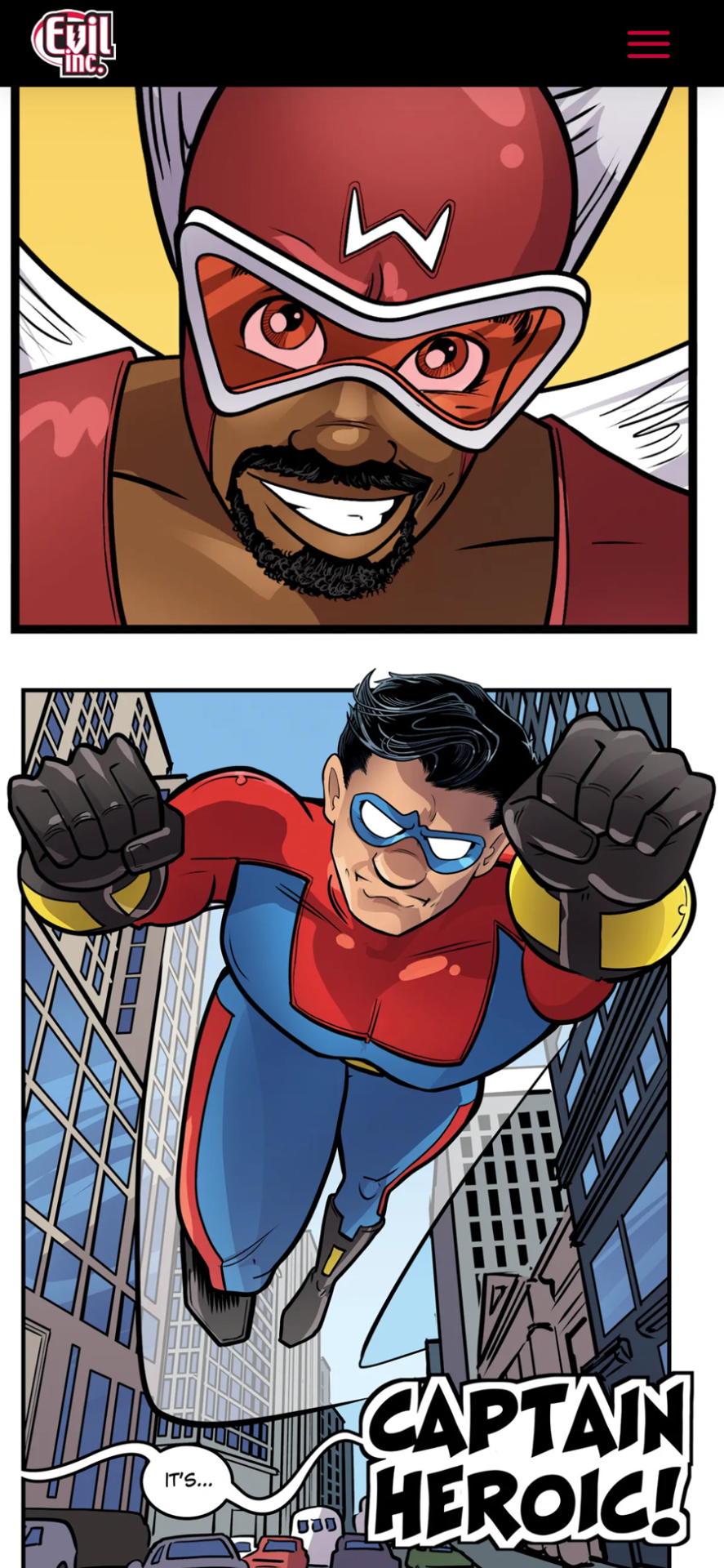
Having taken the pros and cons of each format, how do we make use of both formats to maximize your audience? By creating a responsive comic! What I mean by that is you can create a horizontal version of your comic for anyone browsing your comic on a desktop device and also a vertical format for mobile device readers. It does require quite a bit of extra work, but this gives you the best of both worlds therefore ensuring you have as many readers as you can possibly have. A great example of how this approach can be implemented is on website I built for Brad Guigar’s Evil Inc. webcomic. Notice how you get a traditional format for the on a desktop screen and the webtoon format on the mobile screen.


If you are convinced that you need to post both formats of your comic to your website, you may be asking how do I go about doing that? If you are using WordPress, then the good news is, I have created the perfect WordPress theme for you: Toocheke. It gives you the ability to publish two versions of a comic (desktop version and mobile version) for each post. All you have to do is prep the two sets of images, upload and publish. Give it a test run by downloading it for free here.
Do you need to publish a “responsive webcomic” on your WordPress website?
As a webcomic creator, you are most likely scrimping and scrounging for every reader you can get. By choosing one format over the other, you are automatically eliminating a portion of your potential readers. So why not use both?

